7 Essential Features Every Homepage Must Have
If you’re creating your website from scratch or thinking about updating what you’ve already got, you may be wondering how to make your homepage as engaging as possible. You want to think about the goals of your website and how your homepage can help you achieve those goals.
Instead of sending you on your way to figure out those goals for yourself, I’m going to tell you what your website goals are.
YOUR NUMBER 1 GOAL is to get visitors on your mailing list. The reality is that 92% of first-time visitors to your site aren’t going to buy from you. So, you’re going to need to get them onto your mailing list so that you can stay top-of-mind for when they are ready to buy from you. To do this, you’ll need a “lead magnet.” That is, a freebie that you offer in exchange for their name and email address.
YOUR NUMBER 2 GOAL is to get them to linger on your website so they can get to know you better. You don’t want them to bounce away from your homepage before they’ve explored other pages to see what you’re all about. To do this, you’ll need engaging content and photos that encourage them to dig deeper.
YOUR NUMBER 3 GOAL is to get them to buy from you. To do this, again, you’ll need a lead magnet/email sign-up form, engaging content, information about you and your offerings, and social proof that you know your stuff.
Before we discuss the 7 exact features that you must have on your homepage, let’s go over the basics that cover your whole website. This will be quick!
The Basics that Your Whole Website Should Have
a. You need a clear logo or site title in the top navigation menu. It can be on the left or in the center. It will link to the homepage, which means that you don’t have to have “Home” in your main navigation menu. You’ll see on my site that I have my site title—my name—instead of a logo, in my branded font.

b. You need a clear, minimal top navigation menu. As I mentioned above, you don’t need to include “Home” since your site title/logo will link to your homepage. But it’s fine if you want to put “Home” there. Make sure that your menu fits on one line. It looks cluttered when it spills over onto two lines. Don’t use cutesy names. Make the names very clear so that visitors will know exactly what each heading means. So, “Blog” is better than “Musings.” And I use “Podcast” instead of the name of my podcast: Brand + Design Scoop.
c. You’ll want to use your branded colors and fonts throughout your website. You’ll need one main brand color and an accent color, maybe two. You see that my primary color is that deep blue. I occasionally use a pink as an accent color. My main branded font is Minerva Modern, which is used for my logo and headers—as well as for social media images.

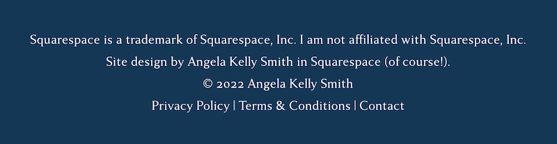
d. You’ll want a simple footer with links to your Privacy Policy, your Terms and Conditions, and your Contact page. It’s fine to have other links there, too. These are the basics that you need. You also need your copyright in the footer. And it’s nice to give credit to the website designer who made your site—if you had someone else make it for you.
e. Finally, do NOT put links to your social media accounts in the main navigation menu at the top. This will just lead people away from your site. Remember that your goals are to get people to sign up for your email list, explore your website, and eventually buy from you. They can’t do these things if they leave your site. It’s okay to put the links in your footer. You just don’t want them to be prominent.
Okay! Let’s get into the…
7 essential features that your homepage must have.

1. Clear headline and engaging photo
The first thing your visitors should see when they arrive at your website is a clear headline that tells what your website is about and a photo that reinforces what it’s about. You’ll see that my headline reads “Website Design + Marketing Strategy.” This is exactly what my services are. This is exactly what I do in my business. The image that I use is a photo of me because I am the face of my business. I could use an image of a computer with a website I’ve created on the screen. In fact, I used to do that. But I changed it to a photo of me to be more personal and because I’m not limited to website design. I do marketing strategy, and I’ll be offering courses soon.
Your headline should be short and concise. When someone first arrives at your site, they’re going to give you about 10 seconds to make a first impression. Ten seconds. They aren’t going to read your text unless your headlines and images pull them in. They scan before they actually pause to read. That’s why you’ve got to be economical with your headlines and make that top image as powerful as possible.

2. Engaging summary text
The summary text is the text that comes right after or just underneath your top headline. It’s ideal to have something here because your headline is so short that it won’t give quite enough information. This text should indicate whom your services are for and what benefits they receive.
Mine reads:
“For freelancers and entrepreneurs who want to establish themselves as authorities in their field, attract more of their ideal clients, and convert would-be clients into paying clients.”
It’s short enough to be scanned. And it’s clear enough to let visitors know if they fit my general client. I give more information toward the end about who my exact ideal client is.
3. Inviting call-to-action
Right underneath the top image, headline, and summary text is where you’ll want to put your call-to-action—the invitation to join your email list. Yes, it may seem a bit pushy. But remember that getting visitors onto your email list the number 1 goal of your website. And you’re not just asking them to “subscribe.” No! You’re offering them a free, valuable download (your lead magnet) in exchange for their name and email address.
Your lead magnet can be a PDF guide. (Mine is a guide to 5 Steps to a Kick-Ass Niche that helps people pick a niche for their business.) It can be a video, an audio, a mini-course, an ebook, or just about anything else you can think of. But it has to be something. If you sell physical products, it can be a discount on their first order or free shipping. People don’t want to sign up for newsletters anymore. They already get too many newsletters that they delete without reading. I know I do! But I do sign up for newsletters that offer me a valuable free download, something that I can use immediately, some sort of guide or even some recipes.

4. Compelling value proposition
Somewhere on your homepage you’ll need to put your “value proposition”—what makes you awesome, the reason why people should hire you. Your value proposition includes what you do, whom you do it for, and the benefits of working with you. Sending people to your Services page or your About isn’t enough. You need to briefly but clearly lay this out on your homepage.
You don’t want to label it “Value Proposition.” You can put it into another section, such as “The Benefits of Working with Me” or “About Me.” Mine is in the section called “Hi, I’m Kelly.” Mine reads:
“I have been running my own businesses for 23 years. I excel in helping other business owners pick a lucrative niche. I create beautiful websites that are strategically-designed to attract your ideal client. And I create marketing strategy plans that give you the specific steps to reach your audience, establish yourself as an authority in your field, and convert would-be clients into paying clients.”

5. Who you are
You’ve got to tell visitors who you are right on your homepage. Don’t have a photo and your name and a button that reads, “Learn More” and leave it at that. Give enough details—though concisely—that will give visitors a good idea of who you are and how you can help them. Save the nitty-gritty details for your about page.
Mine is seven sentences. I start by reflecting who my ideal client is and what they want. I tell them my purpose and what I do—with one life of proof: “I have been running my own businesses for 23 years.” This boosts trust and confidence in my visitors.
6. Striking photos
People love looking at photos. That’s why Instagram is so popular and why the most popular Facebook posts are the ones with images. Most people don’t even read the text that goes along with Instagram and Facebook posts. Unless your business sells products, you’ll need at least one professional photo of you on your homepage. I’ve got two—the top one and the “Hi, I”m Kelly” one farther down on the page. More than that can be too much, unless you’re a lifestyle brand. Then go for it!
All your photos should be high-quality. If you can’t afford to get professional photos right now, make sure that the photos look professional. There are photographers online who give tutorials about how to take the best, most professional-looking photos on your own. At a minimum, prop up your phone, use good lighting, and try portrait mode to blur out the background a bit, or use a lovely background that’s not distracting. Wear a color that looks fabulous on you. Nothing busy. Solid colors look best in photos. Google it to get professional tips!
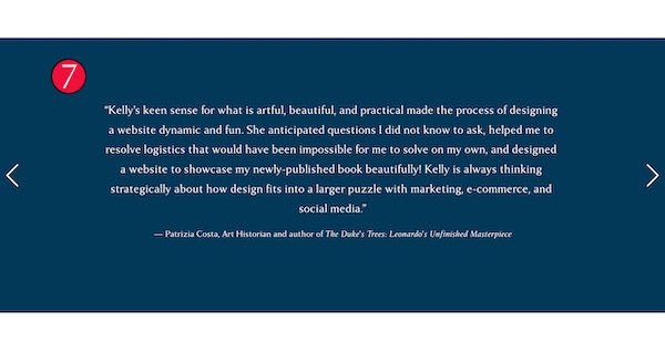
7. Social proof
Finally, you’ll want to put “social proof” on your homepage. That is, you need testimonials. If you’re brand new to your business, you likely won’t have any testimonials yet. That’s fine! As you start to get clients, be sure to ask them for a testimonial as soon as you’ve completed the work. You can even do the first few jobs for free in exchange for a testimonial.
Testimonials help people see that you’ve already done good work, that other people trust you, and that you can do the work you claim you can do. Testimonials help boost trust and confidence in visitors to your website. When they read testimonials, visitors will be more likely to explore the rest of your website, especially your services.
Making sure that you have these 7 essential features on your homepage will help visitors stay on your website longer, help them get to know you better, encourage them to hire you, and, most importantly, make it clear that you want them to join your community—your email list. After you’ve made these changes, come back and leave a comment about what change made the biggest difference for you!